
March 5, 2007
Building an Animated Bumper
(High intermediate level exercise)
By Jude Cotter
So, you've be editing for a while, you're good and solid on the FCP interface and feel at home with transitions, filters and text. But now you want to go another step. You want to more complexity. You want more interest. You want more depth. In short, you want to move into compositing.
Should be easy, right?
Traditionally, this is the point where I tell you that you're mad, it's not easy, it takes years of dedicated study and thousands of dollars and possibly a messy sacrifice to an obscure and angry god. But, guess what. With FCP it is easy. And here's how in, um, a couple of easy steps.
Step one. Go to File > Quit and exit FCP. Stand up, leave your desk and go watch what other editors are doing. This is easier than it sounds, even if you work by yourself, because all you have to do is sit down in front of any television. If you've got Foxtel or some other kind of cable, you've got an even larger encyclopedia of ideas sitting right there in your own lounge room.
Watch what the trends are. See what other editors are doing. You can take the basic principals of something you like and modify it to suit you, or you can even take something you like and set out to copy it in FCP. Just by doing what I think of as 'watching with intent', you apprentice yourself to some of the slickest editors in the business.
Step two. Make a plan. Decide what it is you want to achieve before you start. Don't just sit down and hope that something will happen.
To demonstrate the workflow for this tutorial, I decided that I wanted to make a short bumper where a white line slides onto screen, splits in half horizontally and opens up to reveal vision underneath with text that says 'Up Next', so you can see that I had a pretty clear idea of what I wanted to make before I started.
If you like, you can draw yourself a short storyboard to keep you focused on what you are trying to achieve. This doesn't mean you can't change your mind as you go. It just serves as a useful way of stepping out the process. Here's the storyboard I drew for myself for the composition we are about to build.
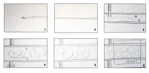
As you can see, you don't have to be an artist. Just rough out what happens where and when. Remember, unless you happen to find yourself illustrating a tutorial, no one else need ever know how bad your artwork is.
And here is the finished composition that I ended up with, for comparison. Some parts of the composition are not in my original storyboard, but we'll get to that.
Click the Play button
If you wish, you can fully replicate this effect in your own copy of FCP. All you need is a picture to put in the bar. All the other parts of the image are generated from standard FCP objects and effects.
Step Three. Build it. OK, lets get going. First we need a white line. That's an easy place to begin. Since we know that we want it to split in half at some point, it's a good idea to make it out of two thinner lines joined together.
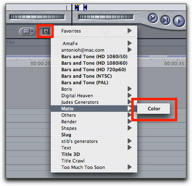
So, make a colour matte by selecting matte > color under the small capital 'A' at the bottom right of the viewer. Drop this grey matte on the timeline, then double click it to load it back into the viewer. In the viewer, select the 'controls' tab and click on the small grey box to choose a new colour. Choose a nice soft white. Don't make it absolute white, because this can sometimes be too bright for TV.
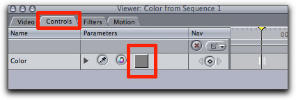
If your canvas is completely white, it means you're on the right track so far.
Now we need to crop this matte down to a line shape using the 'crop' settings under the 'motion' tab. Make the shape about half as thin as you want the final line to be. In this example I cropped the 'top' to 48 and the 'bottom' to 50, giving myself a two pixel wide line.
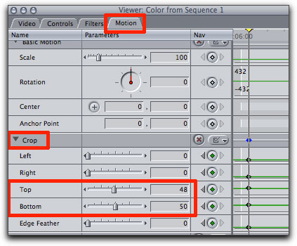
So, that's half the line done, and instead of going through all this again to make another one, let's just duplicate this line so that we have two exactly the same.
Hold option and shift, then grab the 'line' clip on the timeline and drag it upwards so that a copy is made and added to V2. Both clips should have the same start and end times.
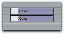
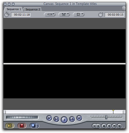
In your canvas you will still only be able to see the single white line, because they are set exactly one on top of the other. What we now want to do is adjust their positions so that they form a single, thicker line.
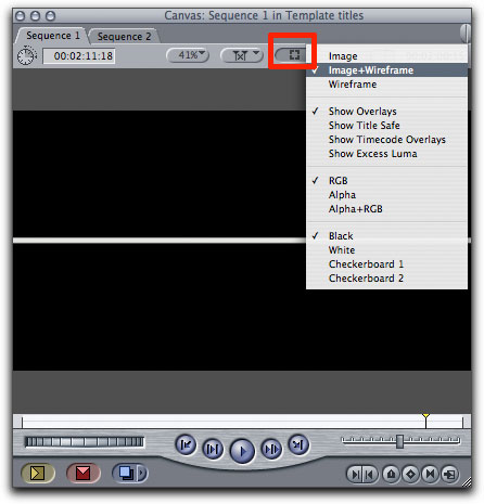
You can do this in the canvas manually by selecting 'image and wireframe' from the small button at the top right of the canvas that looks like a broken square, then selecting one of the clips in the timeline so that a blue bounding box appears in the canvas when a clip is selected on the timeline, then dragging this up or down in the canvas with the mouse.
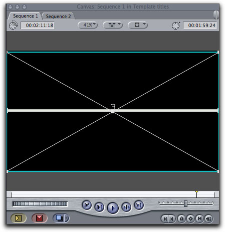
If this is a bit confusing, or you would prefer to work with numbers, you can also shift the position of the lines in the Motion tab (where we just adjusted the cropping). Make sure to load the clip you want to work on into the viewer by double clicking it in the timeline, then go to the Motion tab, and under 'Basic Motion' type 5 into the second box to the right of the word 'center'. Then load the other clip from the timeline and type -5 (minus 5) into the same box.
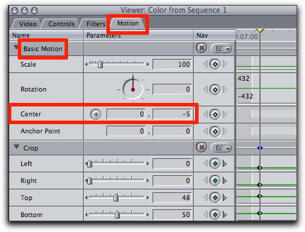
This will have the effect of pushing one clip up by five pixels and one down by five pixels in the canvas, so that they seem to be a single thick line.
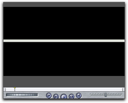
Even if you don't decide to work in the canvas to do this, make sure that you do turn on the image and wireframe box at this stage, as we will be needing it later.
Still with me? Good.
Next we want the white line to slide into the frame from right to left. To do this we can use a simple time saving trick - just add a couple of 15 frame push slides. If you find this confusing, here's a quick tutorial that describes the method I'm talking about.
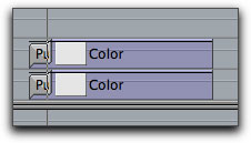
Now we want the line to split in half as soon as it covers the frame from edge to edge, and separate until the two resulting lines are a set distance apart. To do this we will have to use some keyframes.
First, find the point at which you want the split to start happening. In this case, I wanted the line to split as soon as it had reached the left side of the screen, and we know that this will be as soon as the push slide has finished. So zoom into the timeline by pressing apple + until you can easily see frame by frame steps of the playhead. Make sure the playhead is at the frame after the push slide has finished, like so.

Select the top clip on the timeline (on V2) and press the small diamond button on the bottom right of the canvas (or press control k) to add a keyframe. As your 'image and wireframe' mode is turned on in the canvas, you should see the white cross across the canvas turn green. This is a good visual reference to the points that have keyframes.
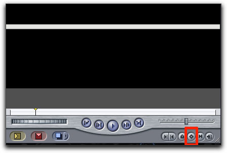
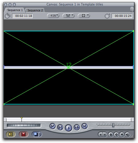
Without moving anything, do the same thing to the bottom clip (on V1).
Now move ahead one frame on the timeline by pressing the right hand arrow key once and do the same thing to both clips, without making any adjustments. What this does is tells FCP that, up to the first keyframe, nothing changes. The second keyframe then becomes the start point for the move that we are about to do.
Let's say we want the split to take about half a second to happen. So, we need to move about 15 frames forward on the timeline. A nice simple way to do this is to deselect everything on the timeline - just click in any gray space on the timeline - and then type +15. This will move the playhead forward 15 frames.
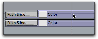
This is the point where we want the split to end, so we need to move the lines to their final positions and then tell FCP to that this is the end point.
In this example, I have moved one clip up by 125 pixels, and one clip down by 125 pixels. So - it's the same as when we positioned the two lines together earlier - just use the motion tab or the wireframe in the canvas to shift the lines to where you want them to be.
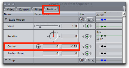
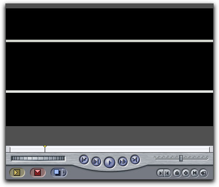
Do this to one clip at a time, and make sure to add another keyframe to each clip when they are correctly positioned. With the top clip selected in the timeline you should now be able to see a motion path in the Canvas that looks something like this.
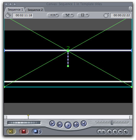
Go to the head of the clip and play it through. The line should now push into the frame and split apart over about half a second to make a bar that we can fill with vision.
Now what we want is for a second set of lines to come in from the lop left of screen and push down to the bottom left of screen, slipping under the first set of lines.
Press shift z to zoom back out on your timeline so you can see what you're doing.
Because we want the new set of lines to appear to go under the first set, we need to bump the first set of lines up to V3 and V4.
To do this, with the pointer selected, drag a box around the two clips you want to move to select them, then hold shift (to stop the clips slipping sideways) and drag upwards. Don't worry if you don't have a V3 and V4 line before doing this, FCP will create them for you as you lift, although you may need to shift up one line at a time. You can also shift clips up and down by selecting them and pressing option - up arrow, or option - down arrow.
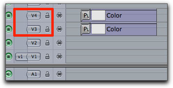
Now we're going to do the same thing we did for the first set of lines. That is, build the new lines on V1 and V2, position them, then add a push slide to move them on-screen. The only real difference from the first set of lines is that these ones are made by cropping left and right instead of top and bottom, and, in my example, I have made one of them green instead of white.
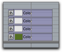
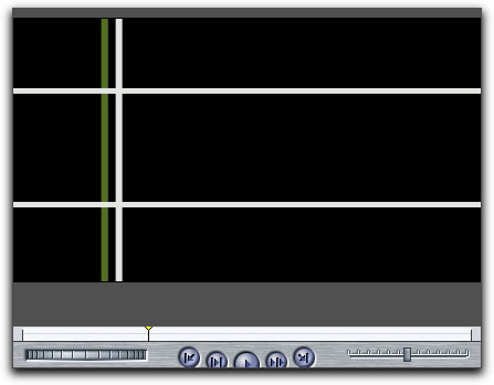
Playing this back, it works OK, but I would rather, aesthetically, that the lines actually cross at the moment that they meet. As you can see that with the push slide method the green line is almost off screen by the time the first set of lines crosses it.
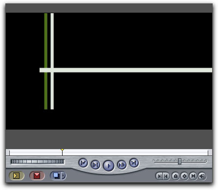
Making the push slide faster or slower doesn't really hit the exact mark I'm after, so we need to move on to a more controllable method. What we'll to do then, is animate the line with a couple of keyframes on the crop setting.
First, remove the push slides that you applied to the vertical lines. Then, as before, find the point on the timeline where you want the effect to begin.
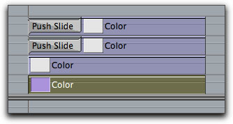
Making sure your playhead is on the first frame of the green vertical line clip, double click the clip to load it into the viewer. Go to the Motion tab and find the crop settings again. Set the 'bottom' value to 100. This crops the line back to nothing.
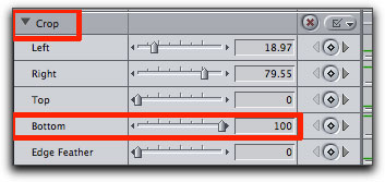
Now step forward frame by frame on the timeline (using the right arrow button) until the horizontal lines just cross over the white vertical line still visible in the canvas. This is the moment in time that we want the two sets of lines to meet. As it happens, in this case it's about 12 frames into the clip.
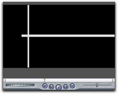
Without moving the playhead from this spot, double click your cropped green vertical line once more just to be sure you've got the right clip loaded, then adjust the bottom crop slider until the lines are touching. Add a keyframe.
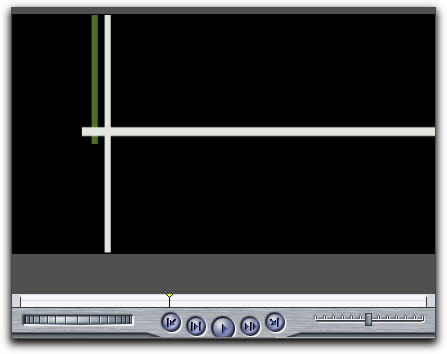
Now step forward on the timeline until the horizontal line reaches the edge of the frame. In this case this is only a few more frames forward. Adjust the crop slider on your vertical line back to 0, so that no crop is being applied and the green line stretches all the way from the top to the bottom of the screen. Add a keyframe.
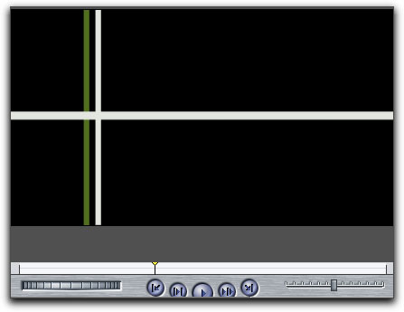
And now you should be able to see that the lines touch just as they meet in time. Repeat this process for the second vertical line, using the green line's keyframe points as a reference.
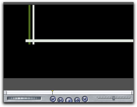
OK. Now what we need to do is fill in the bar we have made with some vision. For this tutorial I downloaded a royalty free image from the web, but you can use virtually any picture or piece of video that you like.
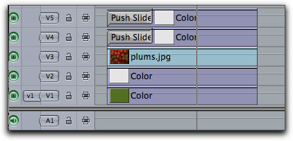
Since we want the picture in the final composition to go behind the horizontal lines and in front of the vertical lines, we need to bump the horizontal white lines up again - this time to V4 and V5, leaving V3 empty.
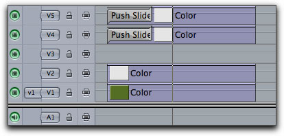
Make sure that the picture you choose is RGB and not more than 2000x2000 in size. Put your picture of choice into V3, and it should look, depending on the size of your picture, something like this.
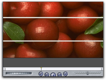
If I use the motion controls to scale and crop my picture down to fit into the bar, it looks like this. Notice that now you can see the vertical green and white lines that were hidden before the photo was cropped.
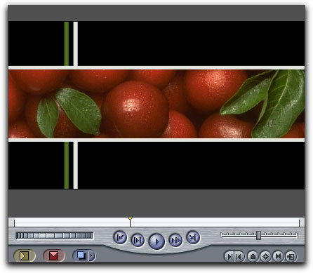
OK. That looks quite nice. Now we need to animate the picture to open up in tandem with the lines, so that it appears that it is being exposed by the lines splitting in half.
Easy enough. Once again, what we need to do is add some keyframes to the 'crop' settings.
The picture shouldn't appear before the line begins to split open, and we know that it doesn't need to start until the end of the push slides, where the lines are sliding across the screen. So we can crop off any of the picture that occurs on the timeline before this point.
The main reason I am doing this is that, to make it easier to see what I am doing, I will be leaving a thin strip of the photograph exposed underneath the white line which would show up in the frame while the line is not there, so it's just easier to remove it altogether until the line has fully covered the frame.
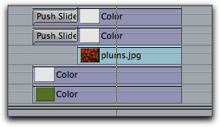
So, we know that by the time the lines have finished the split we want the picture to look as we designed it above, so we need to go to that point in the timeline and add a keyframe to tell FCP that by this time, everything should look like this.
For reference, this 'endpoint' in my composition is about 31 frames from the head - the exact point where the split finishes.
Since we have no other start or end keyframes, FCP assumes that this is what we want the photograph to look like at all times.
But we don't want it to look like this at all times. We want it to start as a thin strip and grow to this size. So go back to the first frame of the clip on the timeline and, using the crop sliders, adjust the picture until it is a thin strip in the middle, hidden underneath the horizontal line.
If you double click the photograph to load it into the viewer, this is what it should look like on the first frame.
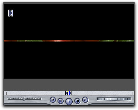
Try to keep the adjustments top and bottom even, so that the animation will be symmetrical. Don't just crop either the top or the bottom.
It may take a bit of fiddling to get to a point you are happy with. Remember that you can work in units less than one - so you could have a value of, for example - 49.92. This amount will depend on your other settings.
Once this is done, set a keyframe. Now when you play back, your picture should 'uncrop' itself from a thin line to the fully exposed position you set up earlier.
In theory you should be able to just use the two keyframes I describe to do this, but it does take some practice to get a good handle on working with keyframes. If your edges don't work at some points you may need to make individual adjustments at those points in time. Just step through frame by frame until you get to a frame you're not happy with, adjust the cropping on your photograph (or video) and set a new keyframe. Beware that each adjustment could make a difference to other keyframes further down the line, which is why it's a good idea to use as few keyframes as possible.
If you look closely you can see that there is a slight overlap on the second frame of my picture expanding, (17 frames from the head of the comp) but this is pretty much disguised by the movement, so I'm not going to get too pedantic to avoid being confusing.
Now we need to add the text and a faint box, just for a bit of added interest.
When working with text, make sure to turn on your title safe guides and always work inside the smaller box. This guarantees that your text will be on-screen, and not get cropped off by older televisions. You can turn on your title safe guides at the top right of the canvas under the button that looks like a broken box. Select 'Show overlays' and then 'Show title safe'.
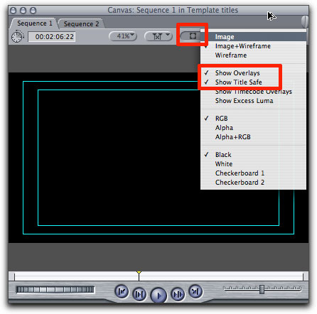
There are a couple of occasions where this isn't always true anymore, in particular when you work in widescreen but your project is displayed by a broadcaster in a different ratio. If you are working for broadcast, check with your station to see if you need to supply 4:3 safe - that is, all your titles have to appear inside an even smaller 4:3 title safe area, even though your actual picture is much wider.
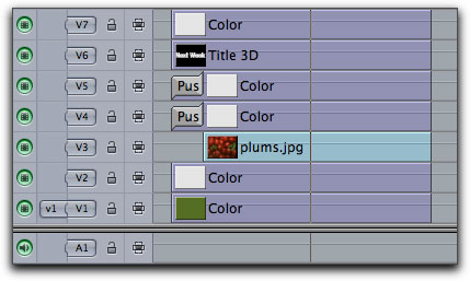
Anyway, let's just make a quick title in Title 3D (or Motion or Livetype or whatever you prefer) and insert it on V6 like so.
As I said before, make sure that you position the text so it's inside the title safe area.
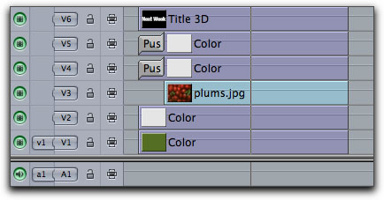
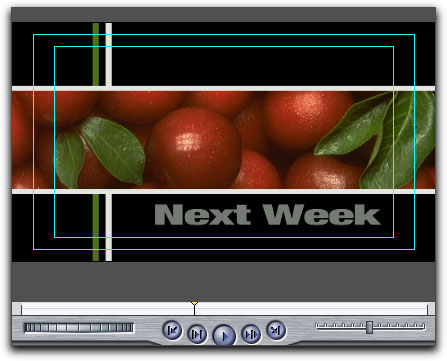
Now to add the box outline. There are a couple of ways of doing this, but here's a quick and simple one. Add a colour matte to V7. Change the colour to match your other white lines, and then use the crop tools to make the edges of the box sit just inside the title safe area.
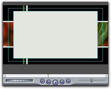
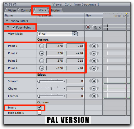
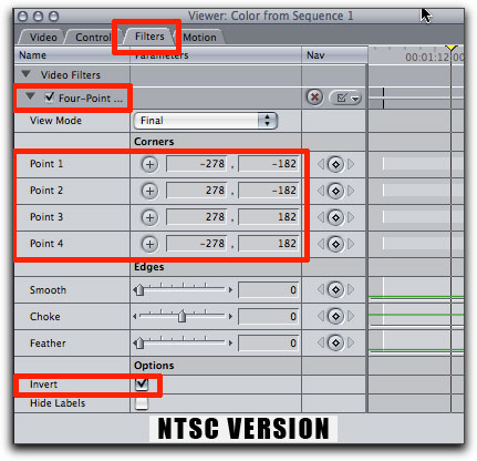
Now apply a 4 point garbage matte with the following settings and then check the 'invert' box to make an outline box.
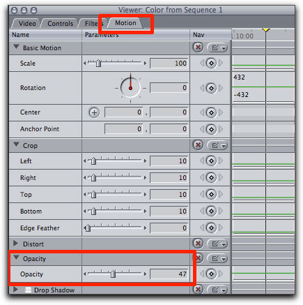
Now soften off the box a bit by reducing the opacity on the timeline or in the motion controls. Mine has been set to about 47%.
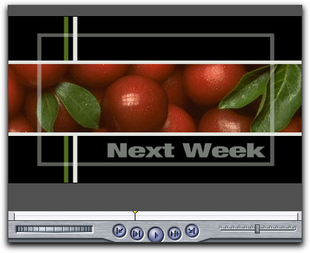
Let's say we want the box and text to dissolve on pretty much as soon as the line split has stopped moving. So we need to step through the vision until we find this point in the timeline, make sure that the text and box outline clips begin at this point and then just add a couple of 12 frame dissolves.
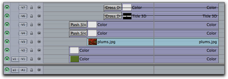
Playing this back, it looks all right, but it feels a bit too.. thin.. to me. So I was thinking that perhaps it would help to fatten the green line so that it fills the left hand side of the screen. Only, I don't want it thick when it pushes on, I want it to grow from a thin line to a thick line sometime after the text has come on. This is basically more of the same thing we've already been doing, but, what the hey, it's good practice.
So, find the point in the timeline where you want the line to start thickening and mark a starting keyframe. I decided that 2 seconds from the head of the clip is a nice place - almost immediately after the box and text have finished fading in. Now move to the point in the timeline where you want the line to have reached full thickness, say, 15 frames later, adjust the line to be the size you want, and add another keyframe. This should work just like the previous 'uncropping' work we did. We're just telling FCP to start with a thin line, and grow over time to a predetermined size.


We could probably stop here. We've already gone one step more than my storyboard, and it looks quite nice. But while I was animating the green line I started to think about having some sort of colour inversion on the plums picture, which splits open in sync with the spreading of the green line to reveal the rich red plums underneath.
It's possible that this will be going too far for the requirements of the bumper and it may look awful and overdone, but there's no harm in trying these things. If you have an idea, give it a shot. If it looks awful, go back a step. Easy.
I want the colour inverted plums picture to split in half, so we need to use the same method as we did for the horizontal white line and make a single image out of two cropped images.
Because we already have an example of the picture that has the correct entry animation, we can simplify this job by starting with two copies of the original.
So, once again, we need to move all the graphics that we want to appear on top of our plums picture up a couple of lines - so, using the arrow tool, lasso all the clips on lines V4 to V7 and bump them up two more lines.
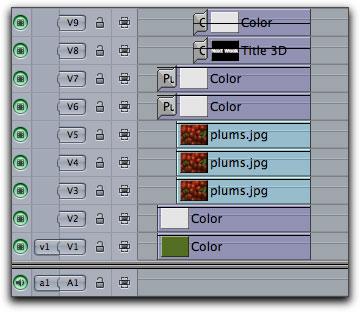
Just to check we are on the same page, your stack should be
V1 and V2 : The green and white vertical lines
V3 : Your picture (The red plums in this example)
V4 and V5 : Currently empty
V6 and V7 : The white horizontal lines
V8 and V9 : Your text and the outlined box.
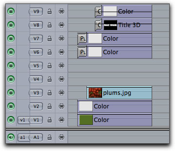
Now, using the option - shift - drag upwards method, drag two copies of the (plums) picture from V3 to V4 and V5.
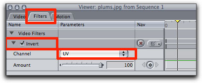
Then apply a Channel > Invert > Channel > UV filter to the two new copies. I chose this because I think it will contrast nicely with the bright reds when the picture splits open. You can, of course, apply whatever filter/colour combination you like.
So now all that's left to do is to split the inverted colour picture open to reveal the natural colour one underneath.
To do this, we need to crop the right hand side of one copy of the picture and the left hand side of the other so that they match perfectly and appear to be one single picture.
Cropping both pictures by 49% will ensure that there is a split in the right place that has a small overlap, so that there is no chance that the bright red plums underneath will show through. So, crop the right side of the picture on V4 by 49% and the left side of the picture on V5 by 49%.
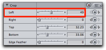
Now find the point on the timeline where the green line begins to thicken. This is where we want the split to begin happening, so mark a keyframe while the gap is completely closed. Then go to the moment when the green line has reached its maximum thickness and use the cropping slider to crop out the inverted pictures to their final positions. In my version I've chosen to have the pictures open out to the inside edge of the green line on one side, and the edge of the faint box on the other side, because these are good logical places to finish, and they look quite balanced in the overall composition. When you find your end points and positions, one more time, mark a keyframe.
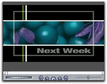
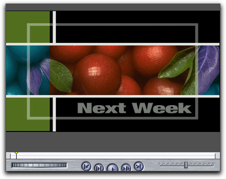
Now play back your composition. Depending on the various choices you have made, it should look something like this.
Click the Play button
And there you have it. Your very own animated bumper.
This tutorial was designed to give a grounding in techniques of layering and animating variables in the motion tab using keyframing. While we have mostly been working with the crop tool, keep in mind that everything in the motion tab (FCP and FCE) and all of the filters in FCP (not in FCE) can be animated with keyframes, so there's a world of possibilities just waiting to be discovered. I hope you have some fun experimenting with these ideas.
The plums photograph was sourced from http://www.xentrik.net/freegraphics/index.php
Jude Cotter lives and works in the wilds of Western Australia as a freelance broadcast editor, FCP trainer and trouble-shooter.
copyright © www.kenstone.net 2007
are either registered trademarks or trademarks of Apple. Other company and product names may be trademarks of their respective owners.
All screen captures, images, and textual references are the property and trademark of their creators/owners/publishers.