November 20, 2006
By Jude Cotter
Since the introduction of the 16:9 frame, more and more editors are having
to contend with the problem of mixing 16:9 and 4:3 footage in the same
program.
This might be because a program has to be delivered as 4:3, but some footage has been supplied by a crew shooting in 16:9, or it could be that your program specifications require you to deliver full frame 16:9, but you occasionally have to incorporate archival 4:3 footage.
Either way, it's no longer as simple as just importing your pictures and starting work. Both of these situations require editors to make choices about how the footage will be presented.
This tutorial is designed to give you a basic understanding of the differences between the two formats, and a couple of ideas about ways to be able to mix them, so that they are kept correct, look good, and fulfill your program specifications.
First off, let's have a look at the inherent problems with mixing aspect ratios, and get a handle on exactly what needs to be changed to make each one work as the other.
I know it seems like a bit of a brain bender when you first begin dealing with aspect ratios, but to put it basically, the root of the whole problem is that the two aspects are a slightly different shape.
4:3 is a rectangle and 16:9 is a wider rectangle.
This may sound overly simple, but it really is pretty much the whole deal in a nutshell.
To help get your head around this, I found it helps me to think of 4:3 as being equivalent to 12:9. (4 units wide x 3 = 12, and 3 units high x 3 = 9. Therefore, 4:3 = 12:9.)
So now you have 12:9 versus 16:9.
Once we have both formats in the same base, so to speak, we can see that 12:9 is nine units high, but only 12 units wide, whereas 16:9 is still nine units high, but of course, 16 units wide.
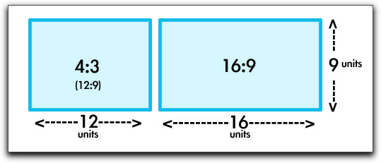
So OK, fine. What does all this annoying mathematical stuff actually mean? It means that if you want 4:3 and 16:9 to work together in the same project, you need to make adjustments to the size of one or the other so that they are equal.
For example, if you want to put a 16:9 picture in a 4:3 (12:9) frame and keep the picture at the same height, you will have some of the picture overlapping the frame at either side, like this.
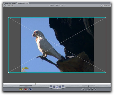
Notice how the blue bounding box of the clip extends outside the edges of the frame. This means that there are parts of the picture you can't see in this frame.
This can work fine, as long as all of your action happens inside the smaller 4:3 frame. The overlap will just be snipped off by the edge of the frame.
If you have action that happens at the edges of the larger 16:9 frame that you want to include in your 4:3 output, you may have to shrink the picture until the clip sides are inside the edges of the 4:3 frame. Naturally, when you shrink the picture, you lose height as well as width, and this results in black bars at the top and bottom of the picture - the 'letterboxed' look that is quite common today.

You can see that with this method you get more sky in front of the cockatoo and some of the leaves behind him which were hidden in the previous picture.
There is one other anomaly about 16:9 that I need to mention at this point, and that's the concept of the 'anamorphic' picture. There are many good articles on the web that explain this in depth, such as this one from Apple: so I won't go into too much detail, but just basically, in the anamorphic process, the picture gets squashed horizontally during shooting, so that you can get a wider picture into a smaller space on tape.
The problem is that when you display this on a standard 4:3 TV, it makes the picture look tall and thin. As an editor, you should be able to tell when the aspect ratio is incorrect, and be able to correct it.
A good way to tell if your footage is being displayed correctly is to look for things that should be circles, like car tyres or logos.
If they look tall and thin, you are looking at anamorphic 16:9 footage in a 4:3 environment. If they look short and fat, you are looking at 4:3 footage stretched to display in a 16:9 frame.
Pictures of people are also a fairly good indicator of whether your aspect ratio is correct. If everyone looks like they have been on an extended holiday at a farm for wayward supermodels, chances are you need to adjust the aspect ratio.
In Final Cut the way to do this is to use the adjustments in the motion tab. Load your clip into the viewer, select the Motion tab at the top of the viewer, then click the twirl-down arrow next to 'Distort' to reveal the distort settings. In the 'Aspect Ratio' setting, you should see either 0, 33.33, or -33.33.


If you're not sure if your picture needs adjustment, set this to 0, and look at the picture, then set it to 33.33 and have another look. Better or worse? What about -33.33? Better or worse? After a while you should start to be able to see pretty much instantly when things are not right, and what kind of adjustment they need.
In these examples the first picture simulates 4:3 footage in a 16:9 timeline. The second picture has the aspect ratio correctly adjusted (set at 33.33), and the third picture is adjusted in the wrong direction (set at -33.33)


Note that the way FCP handles your imported footage depends on the project settings you have selected. If you have chosen to work in PAL or NTSC anamorphic, FCP will automatically adjust the ratios. If you are working in a non anamorphic project, and using an anamorphic sequence, you will have to manually adjust each picture.
So, getting back to business, making 16:9 work in 4:3 is relatively simple. You take a big picture and either chop the edges off, or make it smaller so it fits into your smaller frame size.
But what about going in the other direction? This is much more of a challenge, because you're starting with less picture than frame.
So here's what typically happens when you drop a 4:3 picture into a 16:9 frame.
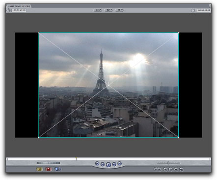
This is known as 'pillarboxing'. FCP does this automatically, in the same way that it allows for the black top and bottom letterbox bars in the 4:3 frame.
The obvious thing to do, you would think, if a picture is too small for a frame, is to apply a bit of judicious scaling until the frame is filled with the picture. And you can do this very easily with the 'Scale' adjustment in the motion tab.
But again, there's the problem of the height being adjusted at the same time as the width, so by the time you've filled the frame from side to side, you've lost quite a bit of the top and bottom of the picture.

Also, even if you've managed to retain enough of the picture to be able to get away with the crop, you will notice that the quality of the picture is considerably worse than what you started with. For some situations, this is an acceptable loss, as you can see with this picture. The blow up was not a terrible loss given the original quality of the video.
Some pictures, and this one is a pretty good example, also lend themselves to another simple cheat. Let's call it .. 'Pretending'. All we do is adjust the aspect ratio so that the picture fills the screen from side to side and then carefully pretend that it is in the correct aspect ratio, even though it isn't.

As you can see here, if you didn't have the two pictures to compare, it would be difficult to tell whether the aspect ratio was right or not. Be aware though, that this kind of footage is hard to find. If there are any people or animals in the scene, forget it. People will notice. In fact, even with this scene, it's probable that lots of French people would spot that it was wrong, even though to most of us both images look pretty acceptable.
I would not personally advocate using this method unless you had a single shot that absolutely had to be used full screen and was fairly undistinguished in terms of content.
So, given that, where to from here? How else can we get the little rectangle to fill up the big rectangle? One pretty good solution is to leave your original footage at the same size and fill up the remaining space with something else. This is a similar to the idea of using cheap rubble to backfill your garden, then adding a smaller amount of expensive topsoil on top where it's really needed. In FCP there's a couple of different ways to do this.
The first method I want to talk about is one I call the 'Pull Focus' effect. By that I mean I'm using a border to try to focus the attention of the audience in a particular place, and to ignore other areas. This is a pretty good workaround because it looks nice, the whole frame is filled from side to side and top to bottom, and the stuff going on at the edges is not too distracting, so after a few moments it gets ignored by the eye.
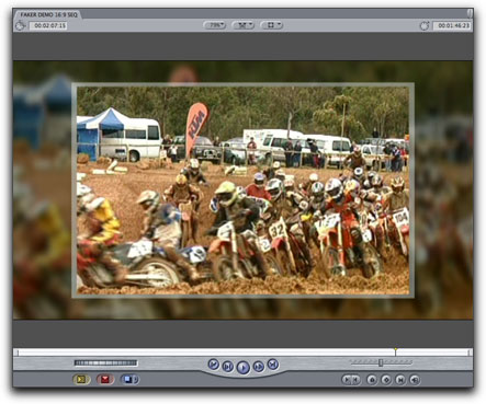
It's also very simple to do. So let's get into it. First, make a 16:9 sequence and drop your 4:3 clip into it. You should get something like this.

Next, crop the top and bottom of your clip so that you get a widescreen feel to the picture. To do this, you can either use the crop tool and work in the canvas with 'image and wireframe' turned on, or you can use the motion tab 'crop' settings to work numerically. I usually work in the canvas and use the title safe boxes as a guide so that my top and bottom are even.
It's also a good idea at this stage to crop off any black fill lines that might appear on either side of your footage.

Next, make a colour matte - which you can find in the 'generators' menu or under the pop-up menu with a capital A on it at the bottom right of the canvas window. Drop this on V2 and crop it up the same way, making it just a bit bigger than your original cropped clip.

Now duplicate the original clip to V3 over the top of the box you just made. What I do here is duplicate the V1 clip I am using by holding option and shift and then pulling the clip upwards to V3. This makes a copy and keeps the clip in perfect sync with the original. It should look something like this.

Next, we want to fill in the background. Double click the V1 clip to load it into your viewer and then scale it up using the motion controls until the entire background is filled with vision.

I then add a bit of gaussian blur to the background clip - you will need to experiment for the best settings for your own footage here, but don't be afraid to make it quite blurry. At this point I also reduce the opacity of the 'box' so that some of the background clip bleeds through.

And that's it. For reference, your timeline comp should look something like this.

You can see in the original in this series that I also reduced the opacity of the background clip in my final version, so that it was darker and less distracting, but this is not essential. Alternatively, you could use a drop shadow on the top clip instead of using the box to give a similar separation.
Next up there's the 'Cover Up' method. This is similar to the previous method, but with the addition of Photoshop masks to give you more options for the final look of the work.
Once again, crop your original to give the widescreen feel, then add the larger, blurry background.

But now, export this frame to Photoshop (File > Export > Quicktime conversion > Still Image > PNG is fine for this) and design a mask that covers the joints between the two versions in a way that you like. This one was done by a friend of mine, Ivan Davidov. The second shot here shows what the mask looks like by itself.


Once you're happy with the design, delete the background layer picture, import your Photoshop mask (with a transparent background) back into FCP, put it on V3 and you're done. Note that you may need to adjust the aspect ratio of the mask when you bring it back into FCP.
Here's a few more of Ivan's examples, which demonstrate how the look can be adapted for different moods. The bars top and bottom of these examples are semi transparent, which is difficult to see in a static picture, but keep in mind that vision does exist all the way to the top and bottom in these pictures. You might want to go a step further and use your show's colours, or add more design elements to the mask. It's entirely up to you.


So far we've covered two simple ways to work with your footage at its original size, but there's also the popular option of making the clips smaller and using more of them.
You know the look - you see it all the time on 'Lifestyle' programs - where there are two or more images running at the same time. This can be used as a great way to disguise the fact that your footage is not 16:9. The downside of this method, I think, is that it gets quite tiring to watch, so I would recommend only using it in small doses, or for special situations, like titles.
I'm going to use the Motox footage from the previous method to make a simple title background for this example, which I call the 'Multiples' method.
Again, it's fairly simple. Here I've chosen two clips, scaled and cropped them down to sizes that I like and put them on V3 and V4. On V2 I have inserted another colour matte box, just to make the clips feel a bit more connected.


From here you can go wherever you want with the background, which you just insert on V1. Here's a couple of quick mock-ups. Notice in these examples that I've also used a drop shadow on the background box to give it some separation from the background.


OK, sure, no Golden Lion for me this year, but you get the idea. To top this off you could add some layers of grit and graphics, some grungy bike noise and a bit of music and you've got a quick and cheap sting, wipe or title.
You could also use this idea, somewhat toned down perhaps, to show the steps in instructional videos. For example in a cooking video you could use three smaller boxes on the left to showcase the ingredients, and a larger box on the right to demonstrate the process. Or an Origami video could have loops of vision demonstrating each fold in three boxes across the screen. Here's a couple of ideas of ways to fill the frame with several images at once. All of these examples are just shots (or proxies of shots, in this case) stacked on the timeline, then scaled and/or cropped and moved into position.


Want more? Of course you do. We all do.
What about using a pre-prepared 'background' to surround your 4x3 image like this?

Well, I say background, but in fact what looks like a background in this example is actually a foreground with a hole cut out of it so that images can be displayed through the hole. This one is the 'Keyhole' method.
Again, this is easy to do in FCP. First, design and build your 'background'. Here I've just used a blue motion background, added a grey box and some rolling text in the background and then put a blue gradient on top. Then I collapsed this into a single movie file by exporting it as a self contained movie. (File > Export > Quicktime Movie > Current Settings > make Movie Self contained).
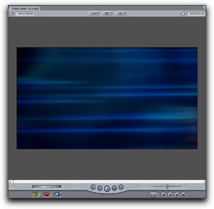


I then reimported the self contained movie and put it on V2 in a fresh timeline. Now all I have to do is cut the hole. To do this I select the clip and go to Effects > Video Filters > Matte > Four Point Garbage Matte to apply a matte to a clip.
Then I double click the clip on the timeline to make sure that it is loaded into the viewer, and select the 'Filters' tab in the viewer to adjust the matte.
To set up the matte, I just click on the small cross next to 'Point 1' and then click and drag my mouse around on the canvas until it is exactly where I want the first point to be.

In this example I want to isolate most of the gradient in the middle, chopping off just a thin edge of the gradient. So, I repeat this process with all four points of the matte filter until I have something that looks roughly like this.

Then the magic bit - just select the 'invert' option in the filter and there you go, you've got a hole.


It can take a little bit of fiddling to get the matte exactly right, but once it's done you have a great speed advantage, because now anything that you put on V1 will appear through the hole and, regardless of its original size, it will always appear to be the same size as the previous item. This also means no more messing about with dodgy edges on mismatched photographs that you may need to insert.
So here's what the file looks like when I put the Dodge picture on V1 underneath the 'background' comp on V2.


Now, that's all well and good, I hear you mutter, if you're working on a cooking show or a motor sport show where you can use a bit of funk now and then, but what do you do if you're working on, say, a historical documentary?
Well, you do the same things, you just theme them a little differently. As an example, I have some footage here which I downloaded pretty randomly from the Prelinger Archives 'Home Movie' section. It's a short black and white clip of a young girl playing with blocks, and it's actually quite a bit smaller than normal 4:3.
So, imagining that this was for a biography documentary, what I did was to get a photograph of an old passport and used the Keyhole method to make a hole where the photograph should go. Then I dropped in the Prelinger footage on V1 and shifted it to fit into the photo hole. The end result is a bit like one of Harry Potter's living photographs. Interesting to look at, within the bounds of the theme, and completely disguising the fact that the footage is only about one quarter of the size of the frame.

Of course, these methods are by no means the only ways of disguising 4:3 footage in your 16:9 projects, just a couple of ideas to give you the basic principles. There are an almost infinite number of changes you can make to these concepts to personalise them for your purposes, and I hope they prove a useful jumping off point for you.
Jude Cotter lives and works in Australia as a freelance broadcast editor, FCP trainer and trouble-shooter.